At Forest of Jewels we care about your privacy and want to be compliant under the new GDPR Law introduced in the EU on the 25th of May. We've taken steps to make sure your personal data is safe and secure. In line with the new law we'd like to remind all EU members that we only keep your personal data for the length of time as is necessary for processing of orders and for our own tax records. You also have a right to any data we keep and that your inclusion in our group/page is voluntary and you can subscribe at any time. Your information is only shared with the immediate companies we need to in order to process your orders. We care about you and your personal data and thank you for your continued support. Companies we use: Etsy, Shopify, Instagram, Craftybase, Google Analytics, Facebook/Instagram Analytics, Pitney Bowes, MailChimp.
Tuesday, May 22, 2018
Tuesday, May 24, 2016
We're All Ears May Challenge Reveal

It has been a little while since I did one of the We're All Ear challenges, mostly because timing just hasn't worked out. Well this month I am a little late to the party, but I just had to participate when I saw the theme. Check our Erin's Link to see more about this month's theme, which was tea parties!
I found this a special theme for May because the month that contains Mother's Day always finds me reminiscing about my own mom and some of the other special ladies in my family who are no longer with us. Tea is often a part of that memory. I have some beautiful painted tea cups from one of my favorite Aunts and my own mom was a huge collector of tea pots. I kept of few of them as reminders of my mom. Tea pots and tea parties are often a fun part of play and I can remember setting up my own; fancy clothes, table cloth and if I were lucky a few special cups and homemade treats to go with!

My earrings follow through on the tea party design theme. I used handmade lampwork glass beads created by Debbie Smith They remind me of both a beautiful floral tea pot and the delicate porcelain cups that go along with them. Also, I am loving these new matte crystals I am seeing so I of course had to add some. These rondelles are in slate blue. I chose them as a tribute to mom, whose favorite color was blue. Finally, the delicate gold charms add that extra special touch and make me think of dress up and going to a party.

Please stop by and check out what Erin created along with all the other participants at this month's reveal post! I would also love to hear your thoughts on my designs and your own tea party memories in the comments below. Thank you for stopping by!
.png)
Saturday, April 2, 2016
Color in Focus Jewelry Design Reveal for March

Hello again and I hope everyone is having a great spring! This is always one of my favorite times of year because even here in Florida we get signs of spring. The trees bud, the birds seem more active and our local Sandhill Cranes get new little wee ones. When I introduce you to the April colors, you will see that spring definitely inspired my choices.
But first, I want to reveal the jewelry I created with the Feb/March color palette. Here is a link to the post I created announcing the colors if you want to be reminded of my choice.
Next, a quick reminder of the beads I chose to work with:

If you remember, I was really looking forward to working with the celery green along with the purple because it was a combination that I hadn't tried before. Here are the results!
 |
| Green Apple Necklace |
First up is what I am affectionately calling the green apple necklace. It really does give me that fresh, juicy vibe so I think I will stick with it. The large green lentil beads really do work very well with the vintage deep purple seed beads The bugle beads worked great as spacers and the blue faceted rondelles really did add the perfect pop. The necklace was much more muted on my design board before I added them.
 |
| Spring Floral Necklace |
If you follow some of my blog posts you know how asymmetrical design is something I struggle with. My eye sees symmetry. Perfect sections of odd number of beads with either one focal or three. But I know it is a trend to not be that way and sometimes a group of beads really do stand out much better when you accent them in this way. The purple poly clay roses flow down the side of the necklace reminding me of the placement of a lei making this design take on a very feminine touch. Adding peridot green crystal rondelles again brings in that pop of color I would never have considered before. This necklace is very lightweight and I love how it has a lot of options for day or night wear.
 |
| Apple Blossom Earrings |
 |
| Purple Ice Earrings |
I find it very interesting how using the same beads in different combinations can take a pair of earrings from soft and feminine to somewhat edgy. The vintage seed beads and crystals are here again, but when adding the vintage bugle beads the earrings take on a less classic look and become more visually daring. I want to encourage you to experiment this way. Lay out your beads in different combinations and see how just changing one or two can really change the whole look. I would love to hear about what you come up with!
Now, to introduce the April color inspiration. When looking for the next palette I wanted two things. First, I wanted to use very bright colors because the last two choices have been much more earthy in tone. So it was time to mix it up! Also, since it is Spring, I felt it was important to choose colors that embraced this time of year. So take a peek at the colors I will be working with for April!
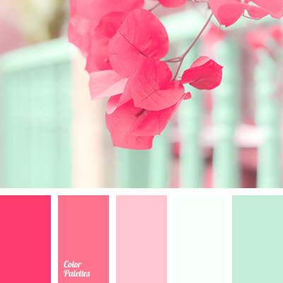 |
| from colorpalettes.net |
I am looking forward to working with the bright crimson colors in combination with the coolness of the white and mint. I also feel like this could be used along with the Pantone colors of the year and for Spring as well. These colors make me think of new flowers, but it also makes me think of water and the beach and even a touch of Europe as well. I will be back mid month with my bead selections to show you what I will be working with.
I would love for you to join me on this journey so feel free to jump right in! If you do create something, please share!
Thursday, March 10, 2016
Color in Focus February/March Bead Reveal

If you are a follower of my blog, (thank you if you are!!!) then you know that I started a new theme in January to post a monthly color study. Well, I kind of messed up in February. I got bogged down in designing and creating some special order pieces and just didn't have time to finish picking my beads, photographing them and creating something. I know that is a good problem to have, but I feel bad because I am really enjoying this process. I wanted you all to know that I didn't give up on it, but to give the wonderful color palette I picked last month its full due, I am going to finish off March using the same colors.
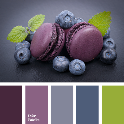 |
| http://colorpalettes.net/color-palette-1277/ |
Here is my post from last month with my initial thoughts :
Now that is out of the way, let's take a peek at the beads I chose from my collection to work with the color palette!

The color I chose to focus on this month are the rich purples. I had some great glass rod beads with matching seed beads I have really wanting to use for a while that fit the color perfectly. While I was searching, I found the polymer clay roses and their undersides are a great fit with the two purple tones. The color I thought would be the most challenging was the celery green color. One of the reasons why I wanted to do these monthly color studies is because even though I love color, I wanted to step outside my comfort zone and use it in a way I had never imagined. Green and purple together is one of those ways. But, when I found those large green lentil beads and laid them next to the purple I could see how they would work. I am really looking forward to designing with them now.

To finish off my choices, I realized that one of the colors was a hint more blue than purple so I chose some Czech glass flower beads and some blue crystal rondelles to represent that blue tone. I also so found some celery green crystals that should also be a welcome challenge with the purple.
Ok, I will be back at the end of the month with my designs. I hope you stop by to see what I make. Also, I would love to hear your thoughts or have you join in and design as well. See you then!
Thursday, February 4, 2016
February Color In Focus Inspiration
Hi everyone! Can you believe it is February already? Seems like we were just celebrating the new year. I hope this means that spring will arrive quickly and all the trees and flowers will be in bloom. It hasn't been too harsh of a winter here in FL this year, but spring is my favorite season and I look forward to its arrival.
Now, on to the reason for this post. every month I will be choosing a group of colors to use as design inspiration. Through out the month we will discuss how the colors work together in beads, I will show you a preview of what I will be designing with and at the end of the month I will reveal my completed piece. On to the reveal of this month's colors!
|
| Color Palettes Palette number 1277 |
Isn't this selection of color just luscious? I find those rich purple tones so yummy and they bring up so many ideas of what I can do. The challenge in this palette is the darker blue and that celery green. I've never thought to put green and purple together. I can't wait to see what I come up with! Are you excited by this month's colors? I would love to hear your thoughts and if you decide to join me, see what you create!
I will be back in the middle of the month to reveal the beads I have picked to work with and explain how they fit in with the color choices. See you then!
Sunday, January 31, 2016
Color in Focus Design Reveal
Hello and welcome back! Today is the day I reveal what I created using this month's color in focus. If this is your first visit, let me catch you up. Back on the 1st of the month I introduced the Color in Focus feature I will be doing this year and introduced the colors I would be designing with. Check out the post here.

In the middle of the month, I introduced the beads I would be using to create my jewelry design. If you follow my work, you will know that these colors are really outside what I normally design with. I love yellow but it usually only shows up as a color pop and I barely ever use red unless it is a bold design. So I really enjoyed the challenge of working with these colors. What does my final piece look like? Let's take a peek!
 |
| Sunburst Necklace |
I ended up not using some of the yellow and white ceramic beads in my final design because they just wouldn't lay right in the necklace. But I do love how the red and yellow glass beads make this piece feel sunny and happy. I can see wearing it on a rainy day and it would really brighten your mood. The grey/tan glass works back to the colors in the palette and also ties back to the grey in the ceramic pendant. Finally those yellow sparkle beads break up the color and add my signature touch of sparkle. If you remember, the original photo from my inspiration piece included and ear of corn. I mimicked the linear pattern from that inspiration in the way I laid out the glass beads in my design. I am very big about working with odd numbers of beads, it is more pleasing to the eye and makes the symmetry work to our brains. Pairs are best left for earrings!
 |
| Sunburst Necklace |
Did you join in this month? Or did you use color outside your own comfort zone? I would love to hear your thoughts on my piece and see your own designs. Coming tomorrow.... February's colors!!
Tuesday, January 19, 2016
Color in Focus Bead Reveal
Back on New Year's Day I introduced you to my new feature, Color in Focus. Over the year, I am going to be taking different groups of color and work with it to create a piece of jewelry. In this post, I am going to be revealing the beads I chose to use to work with this month's palette.
Just to refresh your memory, I chose the Colored Corn palette by Design Seeds for this month's focus.
 |
| Colored Corn by Design Seeds |
I love the colors in this palette. The earthy mixture of red and yellow with those touches of Wedgewood blue and grey really spoke to me. Unfortunately, they aren't the easiest group of colors to pair beads with. I really want to use mostly beads from my stash for this exercise because I am certain most jewelry designers are like me, with large groups of beads that are just waiting to become a beautiful piece of jewelry. I spent quite a bit of time pulling beads out and matching them up. Let me give you a peek at what I chose and then I will explain how the colors match back to the palette.

First, I decided to pick one color as the one to use in focus. When you are trying to pull a design together you need to have one color as your focus or your piece will not be cohesive and will just look off when you try to put it together. The other thing you need to remember is that the collection of colors is a guide. Don't stress out about being perfect with an exact match. I chose to use the maize yellow as my focus color. I was lucky, because the ceramic pendant I found not only had a yellow that trailed into red but also had the edge of the piece glazed in a grey tone that matched so well. From there, I wanted to pay homage to the other colors and also make sure that they all worked together. So I added glass beads in grey-blue, harvest red and golden yellow. A few fun ceramic beads in red, yellow and white and those sparkly yellow beads round out what I will be using in my design.
Don't be afraid of color. If you want to stretch out your design wings and step out of your comfort zone, using color inspirations like the one above is a great place to start. My second bit of advice is to test. Not sure two different colors work together? Test string them or make a quick pair of earrings with them. Two colors that you are certain will clash may just surprise you. And if they don't work, then it is on to the next little baggie of beads! I will be back at the end of the month to reveal what I make with the beads. In the mean time, if you are participating too or doing something else with color I would love to hear from you!
Subscribe to:
Posts (Atom)